March 28th, 2026
11 Domo Alternatives and Competitors for Data Analytics in 2026
By Simon Avila · 33 min read
11 Best Domo alternatives: At a glance
Some Domo alternatives focus on deep visualization and governance, while others prioritize speed, affordability, or natural language analysis. Here's how they compare side by side:
Alternative | Best For | Starting price (billed annually) | Key advantage vs Domo |
|---|---|---|---|
AI-powered analysis without SQL | Lets non-technical users analyze data without SQL | ||
Deep data visualization | $15/user/month; A Creator license is also required at $75/user/month | More customization and visual flexibility | |
Budget-conscious teams | Far cheaper entry cost with strong core features | ||
Enterprise scalability | Strong governance and advanced modeling | ||
Search-driven analytics | Simple search bar interface for queries | ||
Embedded analytics | $399/month, billed monthly | Flexible embedding into apps and workflows | |
SQL-heavy teams | Strong notebook-style analysis for data analysts | ||
Advanced analytics at scale | $300/month for 10 users | Associative engine uncovers hidden relationships | |
Open-source reporting | $1080/year, includes 5 users | Affordable dashboards for smaller teams | |
All-in-one business users | $48/month (Cloud) | Easy setup with strong integrations for SMBs | |
Strategy (formerly MicroStrategy) | Enterprise intelligence | Custom pricing starting at $13/user/month | Advanced governance with mobile BI support |
Why I looked for Domo alternatives
Domo can handle big data projects, but the pricing and complexity don’t work for everyone. I’ve seen sales reps quote minimum annual contracts starting in the five-figure range, and smaller teams often say that’s more than they can afford. I ran into the same wall years ago when I was managing marketing dashboards for my team and wanted to try Domo.
From what I've tested and read, a few common issues push teams to look for alternatives:
Pricing pressure: Usage-based pricing and add-on costs can push total spend higher than teams expect.
AI maturity: Some users say Domo's AI tools feel early-stage and don't always translate well to analysis workflows.
Customization limits: Domo makes it easy to build dashboards, but tailoring them to specific workflows or niche use cases often requires technical work.
Performance at scale: Dashboards can slow down when working with larger datasets, and data connections sometimes require troubleshooting.
1. Julius: Best for AI-powered analysis without SQL
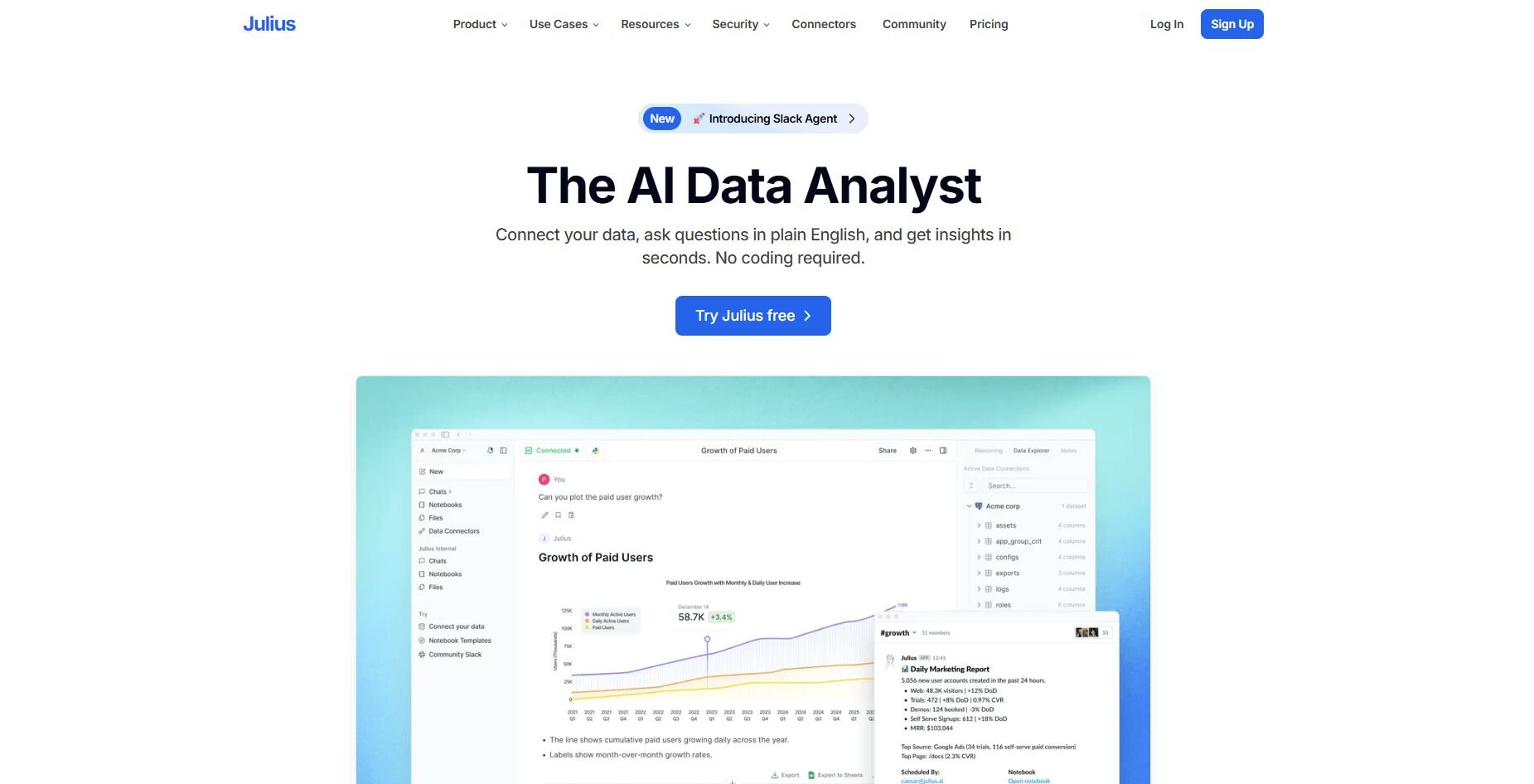
Julius is an AI-powered data analysis tool built for business users who need answers fast. We built it to help you get from a business question to a clear, visual answer without SQL knowledge or analyst support. You connect your data sources, type a question, and get a chart or summary you can use right away.
The platform learns your database structure over time, so queries get more accurate the more you use it. Notebooks let you save recurring analyses like cash flow or net revenue retention and rerun them with fresh data, and you can schedule those reports to deliver automatically to Slack or email on a schedule you set.
Julius works well for the daily and weekly rhythm of business analysis, like quick checks, recurring reports, and clear charts for meetings. It won't replace a structured FP&A platform if you need multi-entity forecasting or consolidations, but for teams that want faster answers without analyst bottlenecks, it covers a lot of ground.
Why it beats Domo
Lower entry cost: Monthly plans start at $33, with no five-figure annual contracts required.
No SQL required: You type questions in plain English and get charts and summaries back directly.
Faster answers: Connect a data source and start asking questions in the same session, with no modeling layer needed first.
Smarter over time: Julius builds understanding of your database structure with each query, so results get more accurate as you use it.
Scheduled reporting: Reports deliver automatically to Slack or email on a cadence you set.
Pros
Connects to Postgres, Snowflake, BigQuery, and other common business data sources
Notebooks let you package and rerun recurring analyses with updated data
Plain English queries make analysis accessible to non-technical team members
Cons
Not a replacement for structured FP&A platforms when you need multi-entity forecasting or consolidations
Smaller third-party ecosystem compared to legacy BI tools
Pricing
Bottom line
2. Tableau: Best for deep data visualization

Tableau is a data visualization platform with one of the widest ranges of chart types and dashboard controls I've tested. I spent most of my time building a sales pipeline dashboard, dragging in data, switching chart types, and drilling into regions and product lines without leaving the main view. That level of customization goes beyond what Domo offers, though the learning curve is steep.
Connecting Tableau to Snowflake and BigQuery was straightforward, and the dashboards held up well with larger datasets. The visual output looked clean, though I did spend time adjusting layouts before they were meeting-ready.Why it beats Domo
Visual flexibility: More chart types and layout controls than Domo, with drill-down options built into dashboards.
Warehouse performance: Connects to Snowflake and BigQuery and handles larger datasets without slowing down.
Community resources: A large library of tutorials, templates, and forums for troubleshooting.
Pros
Wide range of chart types and formatting controls
Strong connections to cloud warehouses and databases
Dashboards look presentation-ready with minimal extra design work
Cons
Takes meaningful time to learn before you get full value from it
Calculated fields and advanced features require hands-on practice to use well
Pricing
Bottom line
3. Power BI: Best for budget-conscious teams
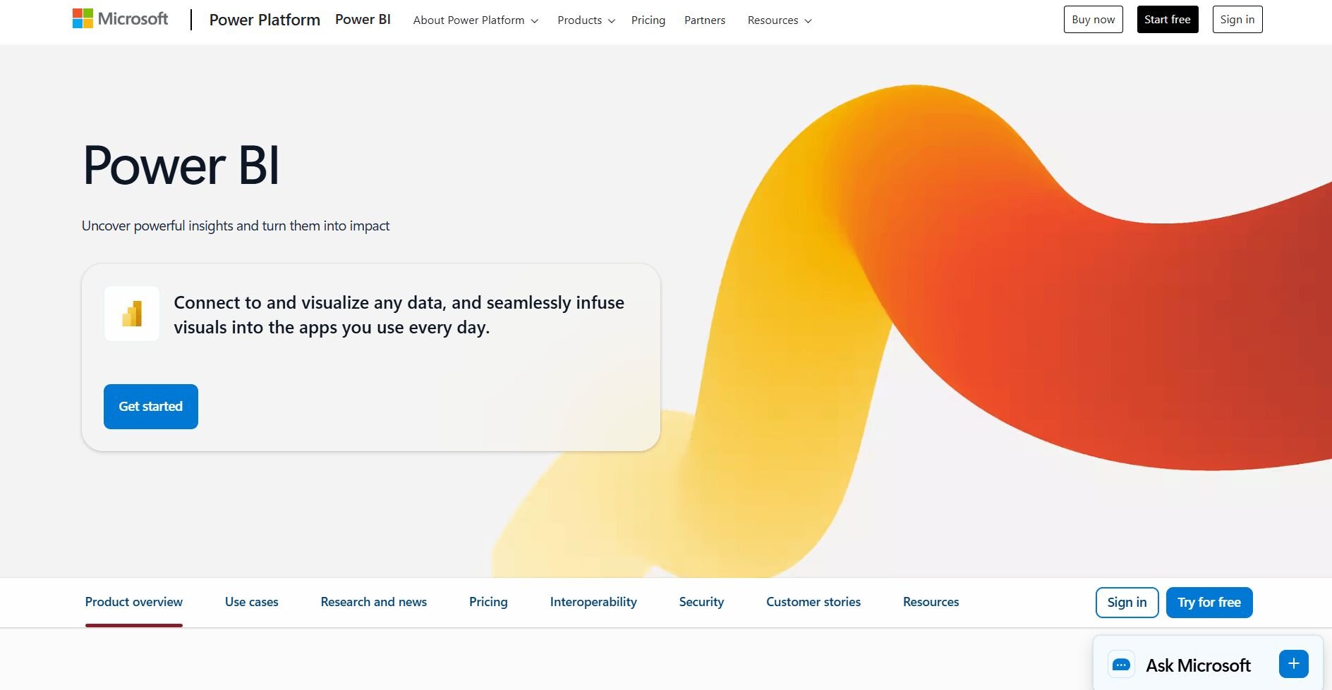
Power BI is Microsoft's business intelligence (BI) platform, and I tested it primarily with Excel sheets and SQL databases to see how it holds up for everyday business reporting. The interface follows Microsoft's design conventions, so if your team lives in Excel, the learning curve is shorter than many BI tools. Connecting data sources was fast, and basic dashboards came together quickly.
Loading larger datasets slowed things down noticeably, and I had to rewrite queries to keep performance reasonable. Getting the most out of Power BI also requires time with its data modeling layer, building table relationships and tweaking measures before dashboards show what you actually want.Why it beats Domo
Lower cost: Per-user monthly pricing instead of annual enterprise contracts.
Excel integration: Import spreadsheets and use familiar formulas without rebuilding your workflow.
Faster onboarding: Microsoft's design conventions make the interface recognizable for teams already using Office tools.
Pros
Low entry cost relative to most BI platforms
Connects well to the broader Microsoft ecosystem
Large library of tutorials and community support available
Cons
Performance drops noticeably with larger datasets
Advanced features require meaningful setup work before they're useful
Pricing
Bottom line
4. Looker: Best for enterprise scalability
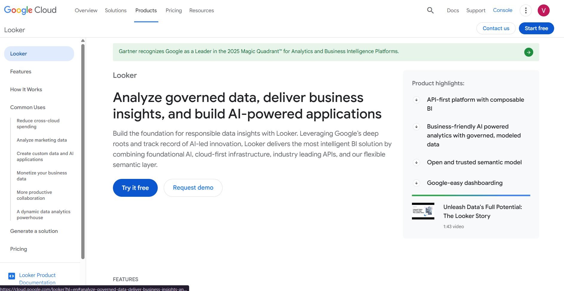
Looker is a BI platform built around a structured modeling layer. I spent most of my testing time working through that layer to understand how it shapes reporting. Once I defined a revenue metric in LookML, every dashboard that pulled from it returned the same number. That reduces the inconsistency you often get when different teams build their own views.
Connecting to BigQuery and Snowflake was straightforward, and performance held up well across larger datasets. The tradeoff is that LookML takes time to learn, and you may not get much value out of Looker until the models are properly defined.Why it beats Domo
Consistent metrics: Define a KPI once, and every dashboard pulls the same number automatically.
Warehouse performance: Connects to BigQuery and Snowflake and holds up well across larger datasets.
Access controls: Manage user permissions and reporting structure across large teams from one place.
Pros
Reliable cross-team reporting once models are in place
Strong governance tools for metric definitions and access management
Connects well to major cloud warehouses
Cons
LookML requires dedicated time to learn before the platform delivers value
Non-technical users may not get much done without analyst support
Pricing
Bottom line
5. ThoughtSpot: Best for search-driven analytics
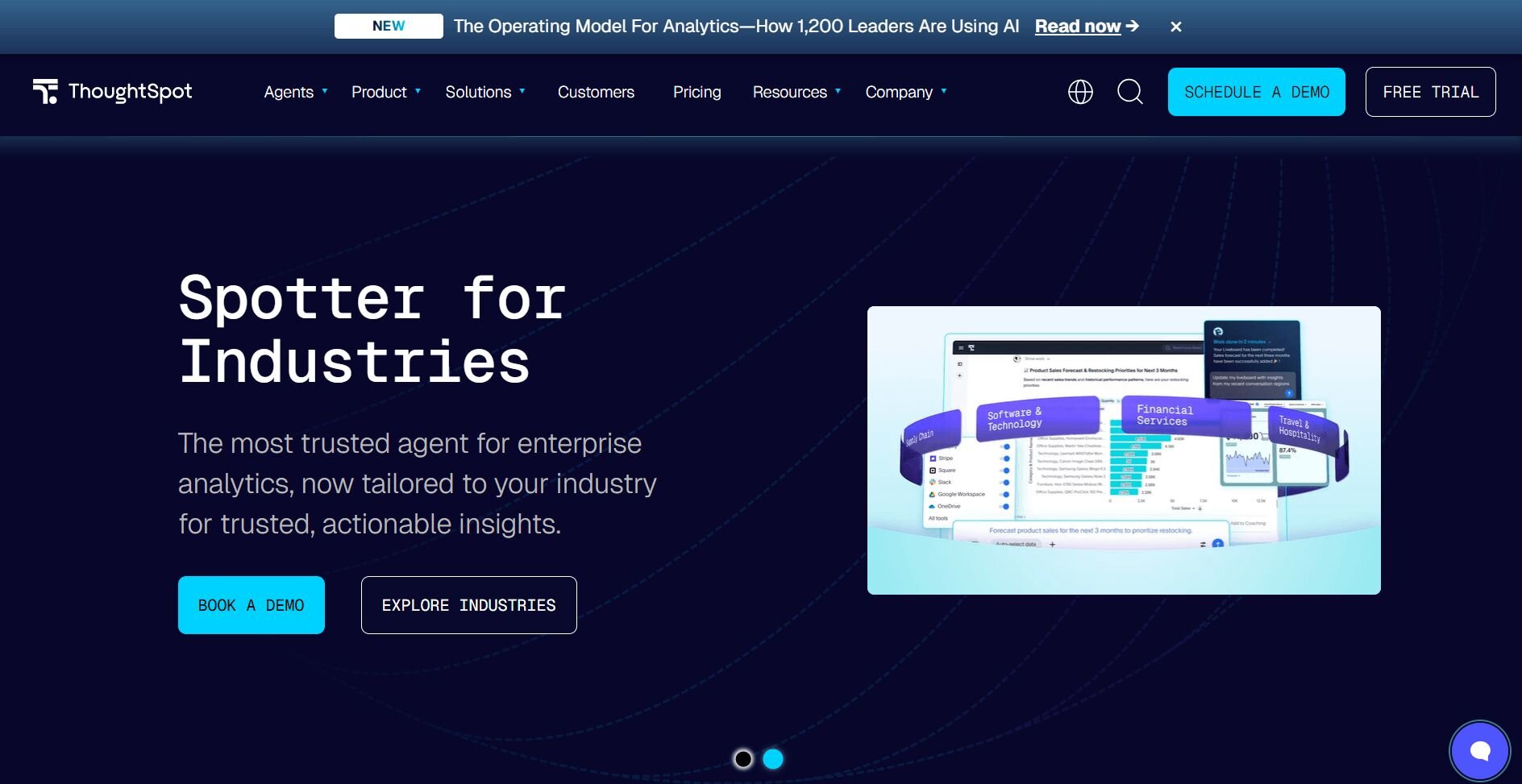
ThoughtSpot is a search-driven analytics platform. I tested it by typing business questions directly into the search bar to see how far it could go without a dashboard setup. Queries like "monthly revenue by region" and "top churn reasons last quarter" returned bar charts and trend lines quickly, which made it noticeably faster than Domo for on-the-spot checks.
The AI-driven insights layer also flagged a churn spike among monthly contracts that didn't show up in my initial view, which added a useful layer of context without extra effort on my end.
The main limitation I ran into was depth. Straightforward questions work well, but more complex analyses often need technical input to get right, and the search interface doesn't always interpret ambiguous queries the way you'd expect.Why it beats Domo
Search interface: Type a business question and get a visual answer without building a dashboard first.
Automated insights: The platform flags trends and anomalies you might not think to look for.
Speed to answer: Get metric checks done quickly without waiting for a custom report.
Pros
Business users can get answers without SQL or dashboard-building skills
Automated insight detection adds context beyond what you explicitly ask for
Faster to get started than most traditional BI platforms
Cons
Complex or ambiguous queries often need technical input to return accurate results
The search interface has limits when analysis requires multiple data relationships at once
Pricing
Bottom line
6. Sisense: Best for embedded analytics
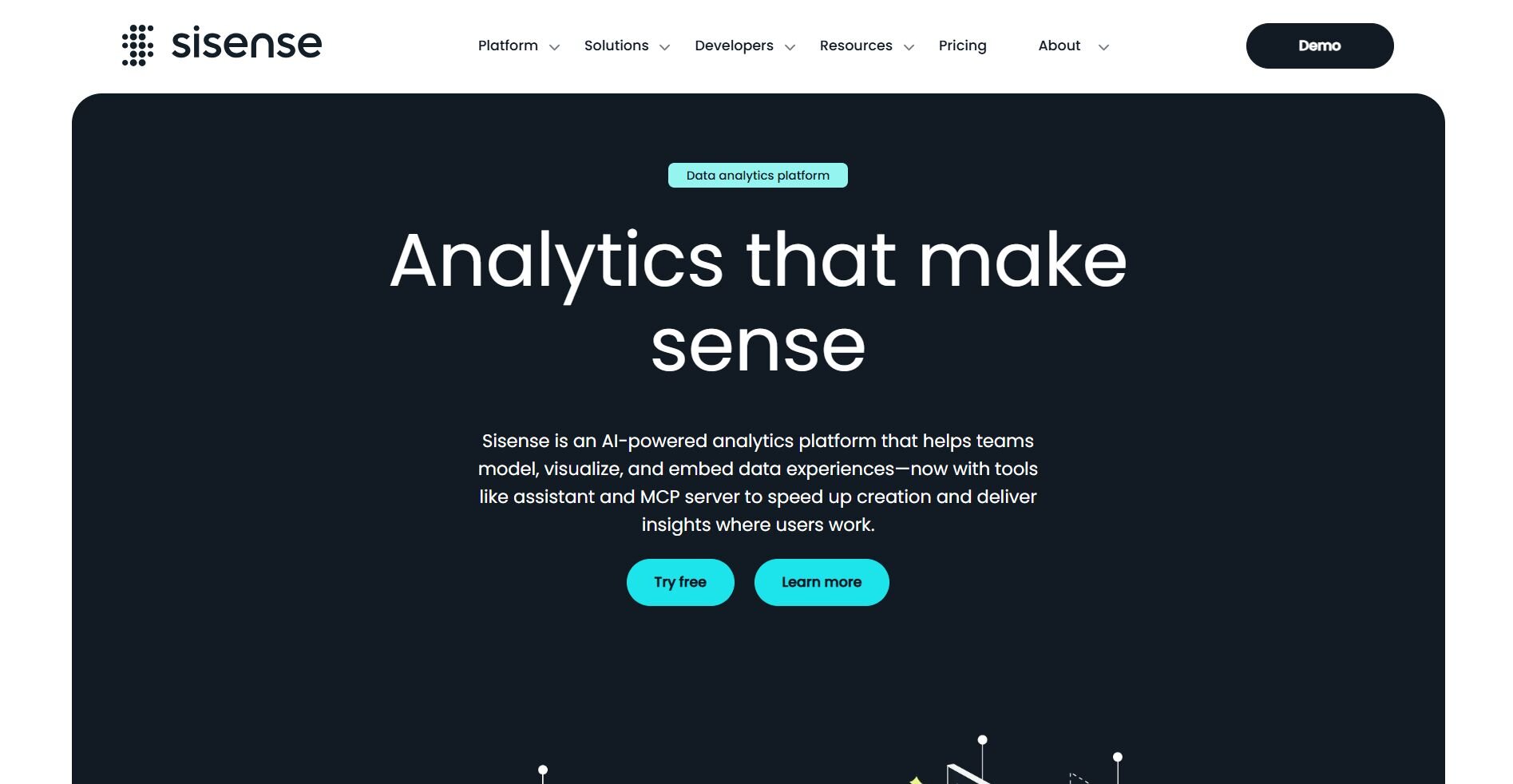
Sisense is an analytics platform built around embedding dashboards directly into other tools and workflows. I tested it by placing analytics inside a sample app environment using the Compose SDK. The setup gave me more integration flexibility than Domo, and once the dashboards were in place, the data was accessible without switching platforms.
The data modeling side took more effort than I expected. The visual model builder, which uses a bubbles-and-lines layout to show table relationships, is hard to read as models grow, and debugging joins or cardinality issues takes real time. Many visual customizations also require JavaScript rather than point-and-click controls.Why it beats Domo
Embedded dashboards: Place analytics directly inside the apps and workflows your team already uses.
Developer toolkit: Build custom, context-aware analytics using the Compose SDK and API layer.
Flexible deployment: Supports both cloud and on-premise setups depending on your infrastructure needs.
Pros
Strong embedding capabilities for product and internal analytics use cases
API-first design gives developers precise control over how analytics are surfaced
Connects to a wide range of data sources and warehouses
Cons
The data model builder is hard to navigate as complexity grows, and debugging relationships takes meaningful effort
Many visual customizations require JavaScript, which adds developer time for changes that feel routine
Pricing
Bottom line
7. Mode: Best for SQL-heavy teams
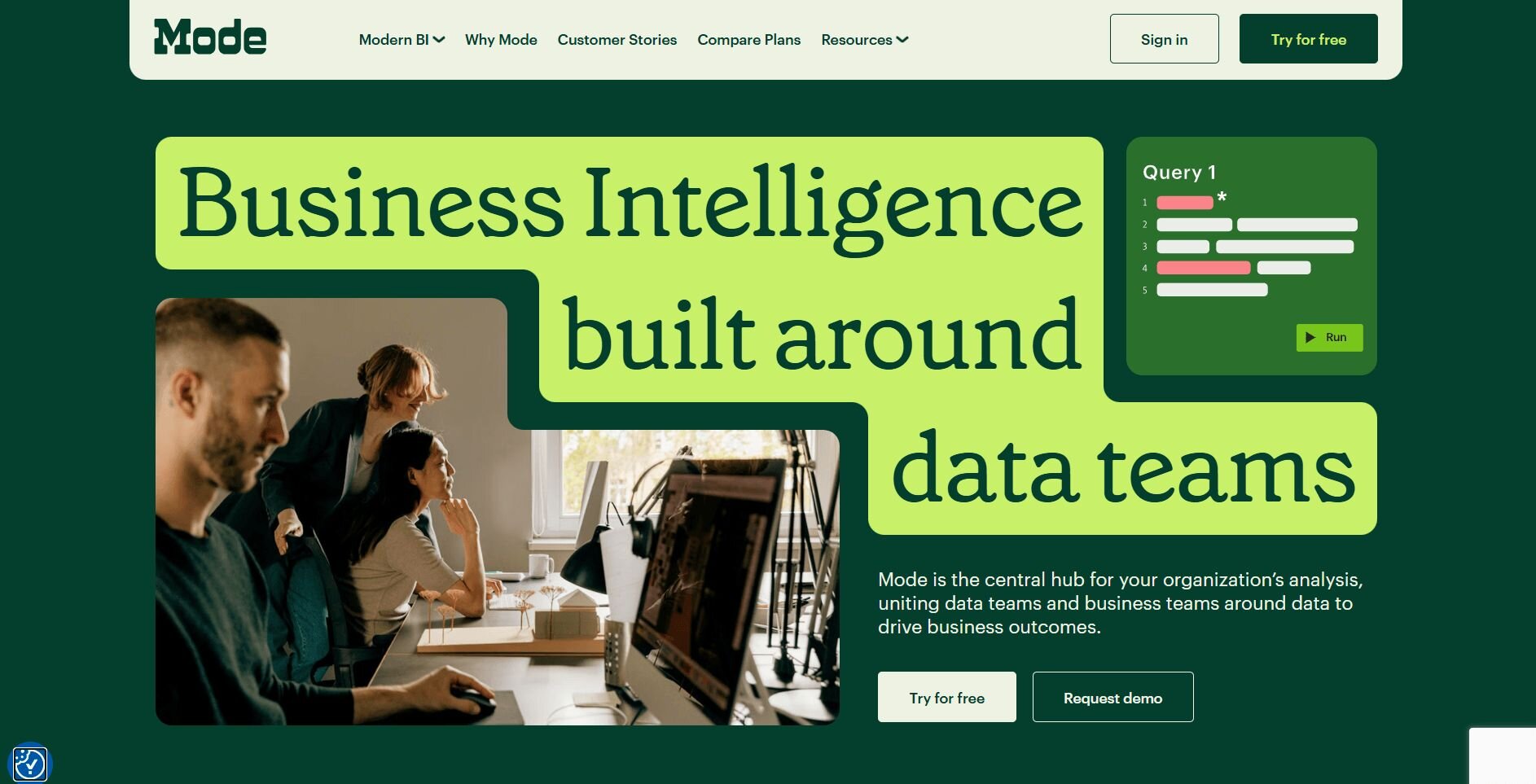
Mode is an analytics platform built around a notebook-style workflow. I combined SQL, Python, and R in the same project to see how much ground you can cover without switching tools.
I pulled campaign performance data from Snowflake with a SQL query, then ran a churn forecast in Python without leaving the workspace. In Domo, SQL and Python live in separate environments, so you'd need to switch between them to replicate the same workflow.
The interface is dark and dense, and non-technical users will likely find it hard to navigate without analyst support. Visualization options are also limited compared to dedicated BI tools, particularly for pivot tables and more advanced chart types.
Why it beats Domo
Multi-language workspace: Combine SQL, Python, and R in one notebook without switching tools.
Reusable reports: Package completed analysis into interactive dashboards that teammates can explore.
Warehouse connectivity: Connects directly to Snowflake and other major data sources.
Pros
Flexible workflow for analysts who need SQL, Python, and R in one place
Finished notebooks convert into shareable, interactive reports
Direct connections to major cloud warehouses and databases
Cons
The interface is dense and hard to navigate for anyone without a technical background
Visualization options are limited, particularly for pivot tables and advanced chart types
Pricing
Bottom line
8. Qlik: Best for advanced analytics at scale
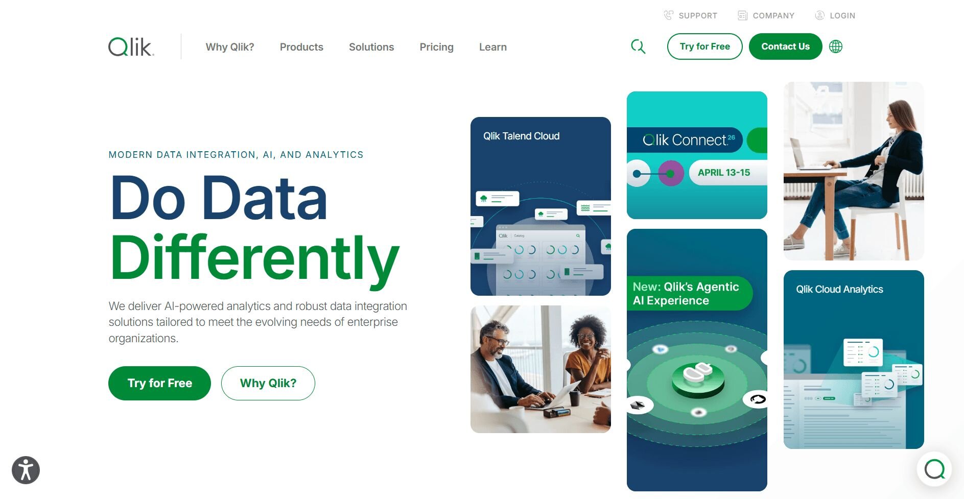
Qlik is a BI platform built around an associative engine, which lets you explore relationships across datasets without predefining how they connect. I pulled sales data by product, region, and time period and was able to switch between those dimensions freely. In Domo, that kind of exploration would require more upfront data modeling before you could move across those relationships.
Performance held up well across larger datasets once the environment was configured, and the AI features helped unveil trends I hadn't explicitly looked for. However, getting to that point took time and effort. The data modeling layer is script-heavy, and the dashboard-building workflow is less intuitive than tools like Tableau or Power BI.Why it beats Domo
Associative engine: Explore relationships across datasets without building predefined joins.
Scalable performance: Connects to large data volumes and keeps dashboards responsive across complex queries.
Trend detection: Use built-in AI features to surface patterns and anomalies that you can investigate further.
Pros
Cross-dataset exploration without predefined query structures
Holds up well across large data volumes once configured
Strong security and access controls for enterprise environments
Cons
Script-heavy data modeling takes meaningful time to learn and can be hard to debug
Dashboard building takes longer than comparable tools due to a less intuitive interface
Pricing
Bottom line
9. Metabase: Best for open-source reporting
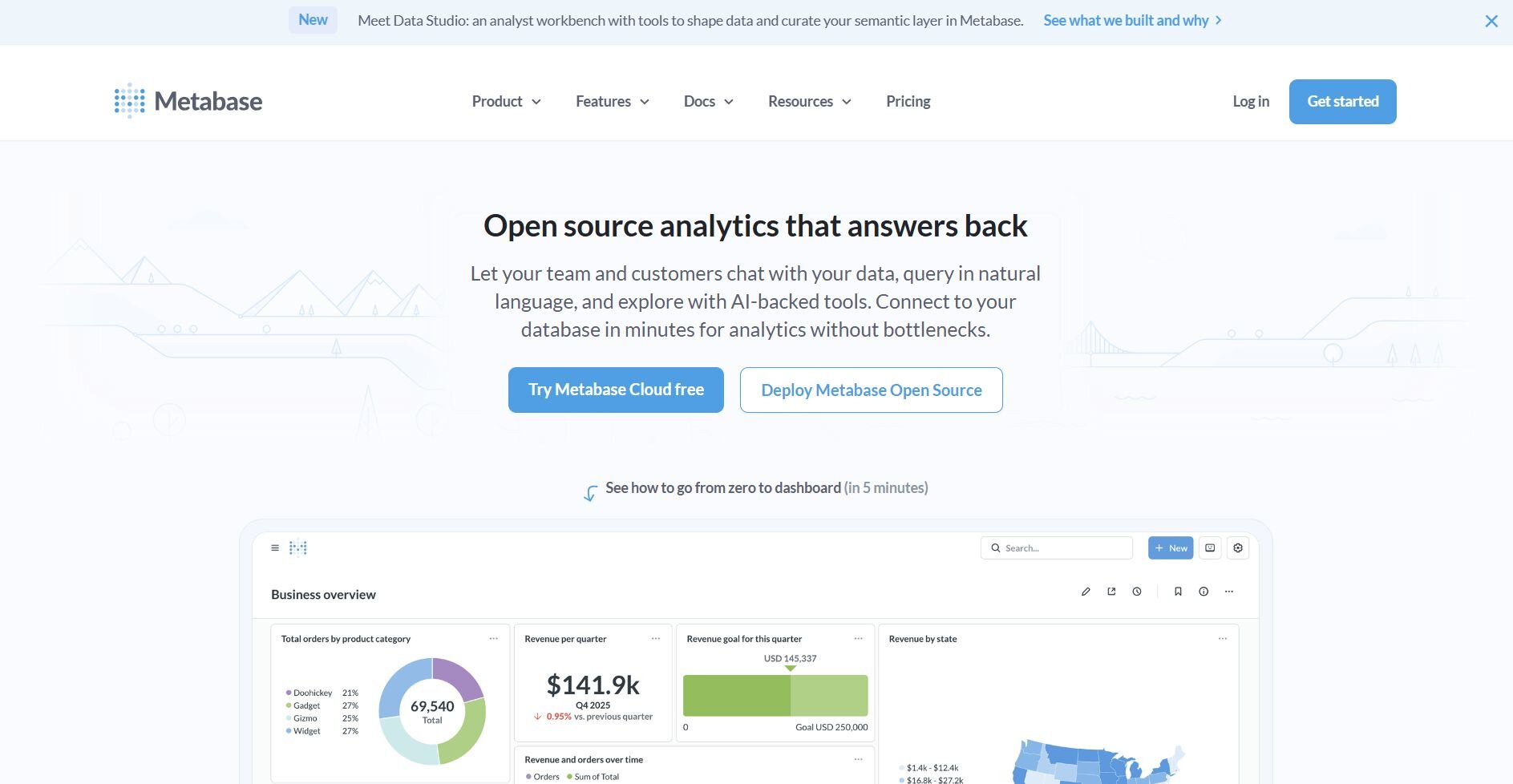
Metabase is an open-source BI tool that also offers paid cloud plans.
I connected a Postgres database and built queries through menus and dropdowns to see how quickly a non-technical user could get to a finished dashboard. A basic sales dashboard came together in under an hour without SQL. In my experience, that's a shorter path than Domo, where you'd usually spend time in the data preparation layer before dashboards are ready to use.
Governance and permissions are available but thin on the lower tiers. Standardizing metrics across multiple teams took more manual effort than I expected, and fine-grained access controls require moving to higher-paid plans.
Why it beats Domo
Low entry cost: A free open-source version covers core reporting needs without a contract.
Fast setup: Connect a database and build dashboards quickly without SQL knowledge.
Lightweight interface: Clean and approachable for non-technical users who need basic reporting.
Pros
Free open-source version available with no upfront commitment
GUI-based querying makes reporting accessible without SQL skills
Quick to set up for small teams with straightforward reporting needs
Cons
Performance degrades with larger datasets since queries run directly against the database with limited caching
Visualization and formatting options are restrictive, particularly for pivot tables and calculated fields
Pricing
Bottom line
10. Zoho Analytics: Best for all-in-one business users
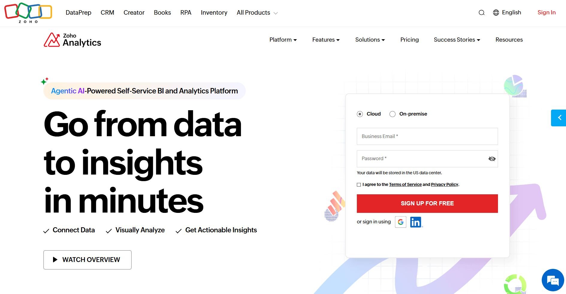
Zoho Analytics is a BI platform built to work alongside the broader Zoho ecosystem.
I connected sample datasets from Zoho CRM and a few external sources to see how it handles mixed data for a typical small business reporting setup. The prebuilt Zoho connectors helped me build a sales dashboard with regional breakdowns and trend lines in under an hour. I found that faster than a comparable Domo setup, where integrations need more configuration before dashboards are usable.
The convenience fades outside the Zoho stack though. Combining data from multiple external sources into one report took more effort than anticipated, and complex schemas made joins and relationships harder to manage without errors. Visualization options are also limited compared to tools like Tableau, particularly for custom layouts and advanced chart types.
Why it beats Domo
Native Zoho integrations: Connect to Zoho CRM, Books, and Projects without extra configuration.
Faster setup: Drag-and-drop dashboard building gets reports up quickly without technical help.
Lower entry cost: Subscription pricing works for small-to-medium business budgets without enterprise-level contracts.
Pros
Quick to set up for teams already using Zoho apps.
Approachable interface for non-technical users building standard reports.
Cloud-based with built-in collaboration and sharing options.
Cons
Data modeling across multiple external sources can be brittle and hard to manage with complex schemas.
Visualization customization lags behind leading BI platforms, particularly for layout control and advanced chart types.
Pricing
Bottom line
11. Strategy (formerly MicroStrategy): Best for enterprise intelligence
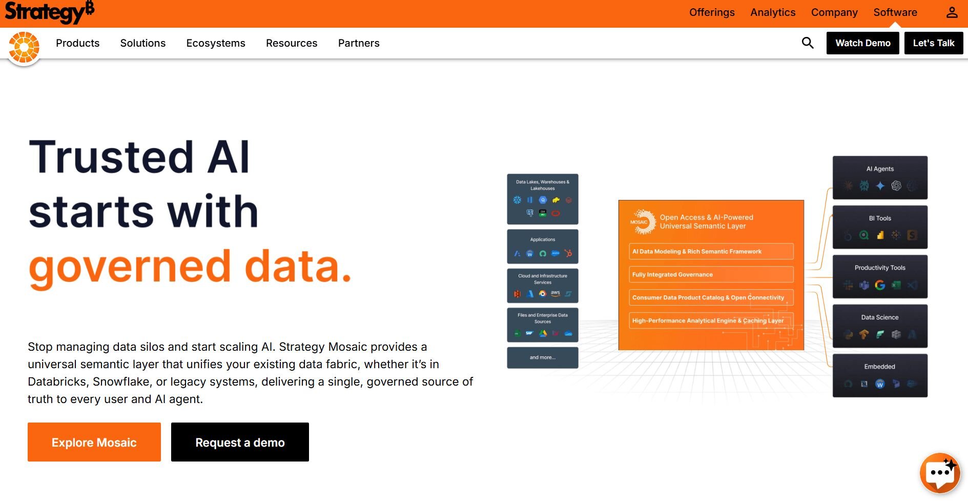
Strategy is an enterprise BI platform built for strict governance and security. I reviewed the demo and documentation to see how it manages reporting across large teams. The walkthrough showed how a metric like annual recurring revenue (ARR) gets defined once at the model level and flows into every dashboard automatically, so finance, sales, and operations all work from the same number.
The interface reflects the platform's age. The tooling across Developer, Architect, and Workstation feels dense and developer-centric, and business users will need analyst or IT support to get anything meaningful out of it. Initial configuration and ongoing administration also require specialized knowledge that many smaller teams won't have in-house.Why it beats Domo
Governance depth: Enforce consistent metric definitions and access controls across large, distributed teams.
Mobile BI: Executives and field teams can access dashboards on mobile devices, including offline.
Security controls: Advanced permission management and audit trails built for enterprise compliance requirements.
Pros
Strong governance and security features for large organizations.
Reliable mobile and offline reporting options.
Scales well for very large datasets and user bases.
Cons
The interface feels dated and developer-centric, making self-service reporting difficult for business users.
Setup, configurations, and upgrades are time-consuming and typically require specialized administrators.
Pricing
Bottom line
How I tested these Domo alternatives
I tested each platform using sample business datasets and ran finance and marketing scenarios similar to real reporting workflows. For platforms that don’t offer direct access, I went through demos and reviewed documentation.
Here’s what I considered:
Setup speed: How long it took to load data, connect a source, and produce the first useful output.
Ease of use for non-technical users: Whether a business user without SQL knowledge could ask questions and get something meaningful back.
Visualization quality: How clear and presentation-ready the charts and dashboards looked without extra formatting.
Integration coverage: How well each tool connected to common data sources like Snowflake, Postgres, and Google Ads.
How to choose your Domo alternative
Teams usually switch from Domo after running into limits with pricing, setup complexity, or dashboard flexibility. I grouped these alternatives by what they do best so you can match each tool to the capability your team needs most.
Choose:
Julius if you want to connect your data and get answers in natural language without writing SQL or waiting on an analyst.
Tableau if polished, presentation-ready dashboards are a priority, and you have time to invest in learning the platform.
Power BI if you're on a tighter budget and your team already works in Excel and the Microsoft ecosystem.
Looker if your organization needs strict metric governance and consistent reporting across large teams.
ThoughtSpot if your team wants to type questions into a search bar and get visual answers without building dashboards.
Sisense if your main goal is embedding analytics directly into your existing apps and workflows.
Mode if your analysts need a flexible workspace that combines SQL, Python, and R.
Qlik if you're working with complex, multi-source data at scale and need a tool that surfaces hidden relationships.
Metabase if you want affordable dashboards and quick setup without enterprise complexity.
Zoho Analytics if you already use Zoho products and need straightforward reporting for a small or mid-sized team.
Strategy if you run a large enterprise that needs advanced governance, mobile BI, and strict access controls.
My final verdict
Tableau gave me the most visual control, and Looker is hard to beat for governance at scale. Power BI works well for teams already in the Microsoft ecosystem, and ThoughtSpot is the fastest option if your team prefers typing questions over building dashboards. Each of these tools has a clear strength, but most assume a level of technical setup that not every team has time for.
Julius works best when speed and accessibility matter more than deep modeling control. If you want to connect your data and start asking questions without waiting on an analyst, it's worth trying. I've found it suits teams that want recurring reports and presentation-ready charts without spending weeks on setup.Ready to switch from Domo? Start here
Many Domo alternatives focus on enterprise governance or deep visualization without making it easy for business users to get answers on their own. As your data needs grow, that gap can slow your team down and put more pressure on analysts.
Julius is an AI-powered data analysis tool that connects directly to your data sources, including Postgres, Snowflake, BigQuery, and Google Ads. You ask questions in plain English, and Julius runs the analysis, builds the chart, and packages it into a report you can share or schedule.
Here’s how Julius helps:
Direct connections: Link databases like PostgreSQL, Snowflake, and BigQuery, or integrate with Google Ads and other business tools. You can also upload CSV or Excel files. Your analysis can reflect live data, so you’re less likely to rely on outdated spreadsheets.
Repeatable Notebooks: Save an analysis as a notebook and run it again with fresh data whenever you need. You can also schedule notebooks to send updated results to email or Slack.
Smarter over time: Julius includes a Learning Sub Agent, an AI that adapts to your database structure over time. It learns table relationships and column meanings as you work with your data, which can help improve result accuracy.
Quick single-metric checks: Ask for an average, spread, or distribution, and Julius shows you the numbers with an easy-to-read chart.
Built-in visualization: Get histograms, box plots, and bar charts on the spot instead of jumping into another tool to build them.
One-click sharing: Turn an analysis into a PDF report you can share without extra formatting.
Ready to see how Julius can help your team make better decisions? Try Julius for free today.
